Accessibility · AI · Native iOS
Fathom
An AI-powered indoor navigation app that gives blind and low-vision people independence in every building, from the first visit — designed by someone who lives the problem, built with agentic workflows that turned a solo designer into a shipping team.
Overview
The Work
253 million people worldwide live with visual impairment. GPS-powered navigation works outdoors, but goes silent the moment you step inside a building. Hospitals, airports, office buildings, transit stations — the indoor spaces where wayfinding matters most are exactly where existing tools fail. The alternatives are asking strangers, relying on sighted guides, or simply avoiding unfamiliar places entirely.
Fathom is a native iOS app that turns the phone camera into an AI-powered navigation companion. It watches continuously, speaks only when it matters, and guides users turn-by-turn through any indoor space without pre-loaded maps, installed beacons, or help from another person. It works anywhere, on the first visit. Fathom is available at fathomvision.app and on TestFlight for beta users.
I have Leber's Hereditary Optic Neuropathy — a condition that caused significant vision loss starting in childhood. I've navigated the world with impaired vision for most of my life. That lived experience is the foundation every design decision sits on. It's also why I refused to treat this as a hackathon project or a proof of concept. The people who need this deserve the same design rigor I'd bring to any enterprise product — more, actually, because the cost of getting it wrong isn't a bad quarterly metric. It's someone walking into a glass door.
I came into this as a product designer and UX practitioner, not a software engineer. The project became a vehicle for learning a parallel set of skills: Swift, software architecture, AI and computer vision concepts, mobile hardware, performance optimization, GitHub workflows, and the App Store submission process. Fifteen years of product design methodology transferred directly — the PRD, the systems thinking, the research practice, the information architecture. They just needed a new context.
Challenge
The Problem
Indoor navigation for blind users is an unsolved problem not because the technology doesn't exist, but because previous approaches all require something that isn't there. Some apps need pre-built indoor maps that most buildings don't have. Others require Bluetooth beacons or infrastructure investment from building operators. Sighted-guide apps work, but they create social dependency — you need another human available every time you walk into a new building.
The design challenge was harder than the technical one. Any solution that adds cognitive load — constant narration, alarm-like alerts, complicated mode switching — would be abandoned within a week. Blind and low-vision users have developed sophisticated mental models for navigating the world. They don't need an app that tries to replace their existing skills. They need one that fills the specific gaps their cane and spatial memory can't cover: reading signs they can't see, detecting hazards above cane height, and providing turn-by-turn directions in spaces they've never been.
And the spectrum of visual impairment is wide. Someone with tunnel vision and someone with no light perception have fundamentally different needs from the same app. Any solution that treats blindness as binary — you can see or you can't — will fail half its users.
The most important thing a guide can do is stay quiet when everything is fine. Trust builds in the silence.
Approach
How I Worked
Before any code, I structured this the way I'd structure any product initiative: community research first, design artifacts second, building third. The difference from my usual workflow was that "building" in this case meant learning Swift, understanding how iPhone hardware works, managing version control on a growing codebase, and eventually navigating Apple's App Store submission process. The career skills transferred — structured PRDs, systems thinking, user research — they just needed a new context to land in.
Community-first research
Three insights from the blind and low-vision community shaped everything. First, experienced navigators don't want a running commentary — they want a system that behaves like the best human guide: present, attentive, and quiet until something matters. That became Lookout mode's core principle: silence means safety. Second, trust is directional — users need to trust what the app says, but they also need to trust what it doesn't say. An app that cries wolf destroys confidence faster than one that misses an occasional obstacle. The false-positive tolerance is near zero for this audience. Third, the full spectrum of visual impairment demands that every interaction have visual, audio, and haptic channels — no information conveyed through a single channel alone.
System prompts as design artifacts
In a product where the AI's voice is the primary interface, the system prompts aren't engineering details — they're the most important design artifact in the project. I iterated on them the way I'd iterate on a component library: with explicit rules, anti-patterns, and personality guidelines. The Lookout prompt specifies exactly what triggers speech (steps, head-height obstacles, collision-course people) and what doesn't (walls, furniture not in the path, sounds the user can hear themselves). It explicitly forbids the AI from narrating safe, clear walking. The Snapshot prompt structures descriptions spatially — space type first, then ahead, left, right, landmarks, signage — so blind users build a consistent mental map regardless of the environment.
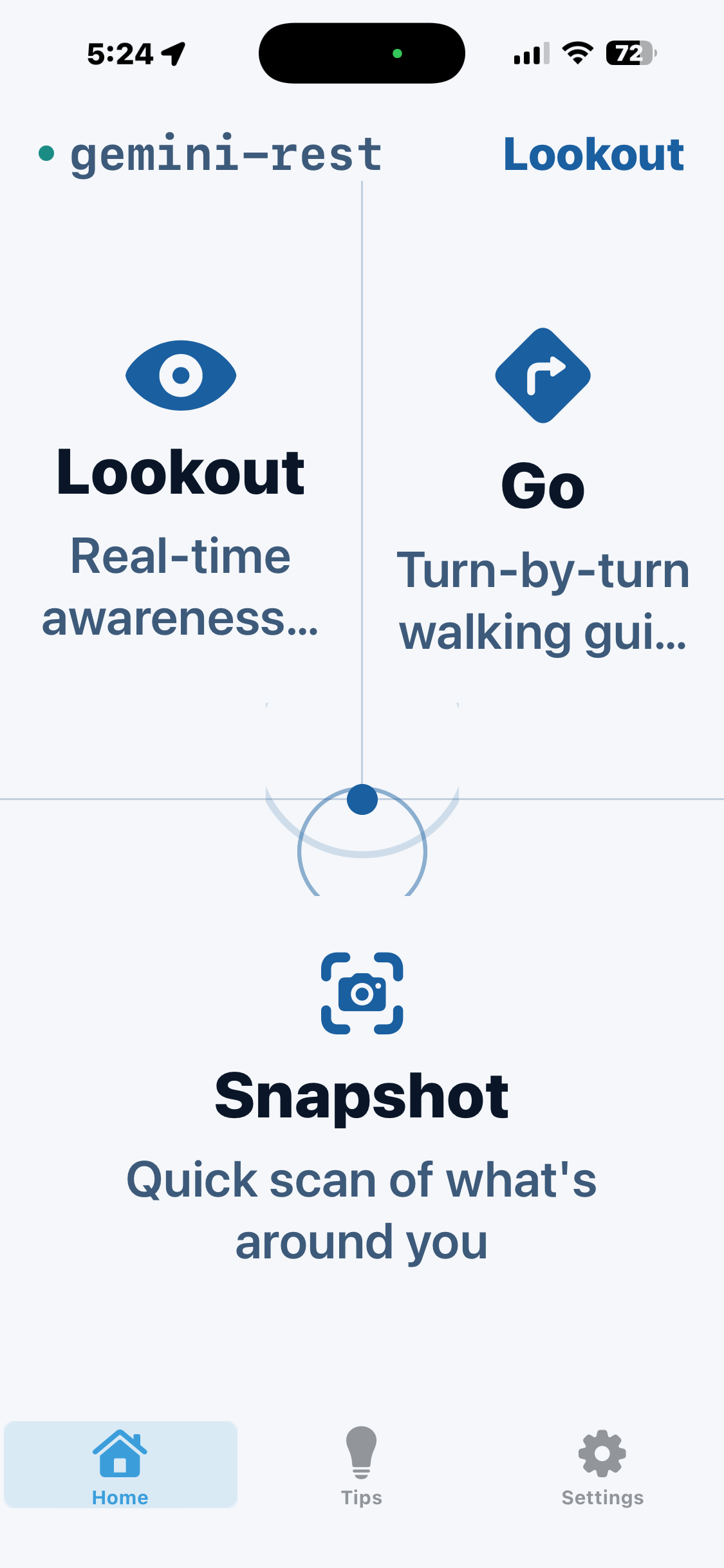
Mode architecture through user feedback
Early concepts had five modes. Community feedback compressed them to two modes (Lookout and Go) plus one embedded capability (Snapshot). The reduction made the app learnable in under a minute — critical for users who experience it entirely through audio and haptics. Snapshot lives inside both Lookout and Go as an on-demand capability — tap once or press the iPhone's Action Button to capture the scene and get a spatial description, without switching modes. The mode architecture was a design decision driven by how blind users actually navigate, not a technical decision driven by how the AI works.
FathomUI — designing beyond the visual
FathomUI is the design system I built for this project, extended from SonarUI. The visual layer uses a warm grayscale palette with no pure black or white — because pure extremes cause halation for low-vision users. Contrast ratios exceed WCAG AAA on primary surfaces. But the real design work was extending the system into sonic and haptic languages. Every mode transition has a distinct sound. Every hazard severity level maps to a haptic intensity. Silence is a defined state — no ambient sound when Lookout is active and the path is clear. The app is equally complete whether you're experiencing it through sight, hearing, touch, or any combination.
Choosing Swift and building native
Why native? The accessibility stack on iOS — VoiceOver, AVSpeechSynthesizer, ARKit, LiDAR, Core ML — only works correctly in native code. React Native and Flutter abstract the platform in ways that create friction with VoiceOver specifically. Fathom needed fine-grained control over how the app interacted with OS-level accessibility APIs. That meant Swift. Coming in knowing almost nothing about Swift, I went from blank file to 23,000 lines of production code. Not by delegating everything to Claude — that produces code you can't maintain or debug. By learning enough about Swift's type system, concurrency model (async/await), and SwiftUI patterns to review code intelligently, catch architectural mistakes, and make the calls Claude couldn't. Swift's protocol-oriented design turned out to be well-suited to the abstraction layer Fathom needed — the AIVisionProvider protocol is idiomatic Swift, not just a good idea.
AI architecture and model selection
Fathom runs two AI systems simultaneously. Gemini Live API handles continuous vision analysis — it's a streaming WebSocket API designed for real-time multi-modal input, which meant I could pipe camera frames at intervals and get low-latency spoken responses without a full round-trip request-response cycle. The target was under 2 seconds from camera frame to spoken alert. The challenge: Gemini has a 10-minute session limit that wasn't obvious from early documentation. When sessions expire mid-navigation, accumulated context — landmarks, spatial memory — gets lost. The session bridging system rotates to a new session at the 9-minute mark, carrying context forward via structured system prompts. That was the hardest technical problem. Core ML with YOLO handles on-device object detection as a fallback when Gemini is unavailable. When the network is slow or offline, the app degrades gracefully rather than failing. The AIVisionProvider protocol abstraction means the rest of the app doesn't know which model is active — and when a better model ships, it's a configuration change, not a rewrite.
LiDAR and mobile hardware
Before Fathom, I knew LiDAR existed on iPhone Pro but not how ARKit exposed it or what it was actually useful for. iPhone Pro's LiDAR generates a real-time depth map using infrared pulses measured in time-of-flight. ARKit exposes this through ARFrame's depthMap property at 192x144 resolution — more than adequate for step detection. The implementation analyzes a vertical strip in the lower frame to detect depth discontinuities that correspond to steps. The challenge was false positives — depth discontinuities also occur at furniture edges, doorways, and material transitions. Six-frame temporal filtering eliminated most false positives without meaningfully increasing response time. Running ARKit and Gemini streaming simultaneously is computationally expensive. The frame rate system — 10fps camera, 1 frame per 3 seconds to Gemini — was designed to keep the device within thermal limits during sustained navigation.
GitHub, version control, and agentic building
I built 23,000+ lines of production Swift in six weeks, working solo, using Claude Code as an agentic coding partner. The workflow: I wrote the PRD, feature specs, and system prompts. Then I worked with Claude Code to scaffold the architecture, implement services, and iterate on Swift code in real time. GitHub workflows mattered more than I expected on a solo project. Feature branches for distinct capabilities. Descriptive commit messages that remained readable six weeks later. The discipline of version control made it possible to roll back architectural decisions that turned out wrong. There were branches abandoned after two days and service layers rebuilt from scratch when the first approach couldn't handle edge cases. The git log is a more honest record of how this software was built than any case study. The PRD and feature specs became the mechanism for communicating design intent to an AI coding partner that knew Swift but had no context about blind users' needs. Without the spec, Claude would have produced technically correct code that solved the wrong problem.
Real-device testing and performance optimization
Every feature was tested on a physical iPhone 15 Pro — LiDAR step detection calibrated through actual stairwells, VoiceOver compatibility verified across every screen, haptic patterns tuned for one-handed grip with the phone facing forward at chest height. Performance issues don't appear in code review. They appear when the app has been running for 20 minutes and the phone is warm. ARFrame memory leaks — where captured depth frames weren't being released quickly enough — only appeared under sustained use. The fix required understanding Swift's Automatic Reference Counting memory model. VoiceOver integration introduced another category of conflicts: VoiceOver and AVSpeechSynthesizer both want to control the audio channel. When VoiceOver is active, hazard alerts from AVSpeechSynthesizer can get interrupted or queued behind VoiceOver announcements. Designing around those conflicts required testing with VoiceOver actually enabled — which is a different experience from testing with it off, and exposed interactions that weren't obvious from reading the APIs.
App Store submission and TestFlight
Getting an app onto TestFlight involves steps that aren't in any product design curriculum. App Store Connect (Apple's developer portal), provisioning profiles, entitlements, privacy manifest files — a new requirement Apple introduced in 2024 that required every framework to declare its API usage — and App Review guidelines. TestFlight distributes to beta testers without going through full App Review, but it still requires a correctly signed build and an accurate app description. The Apple Developer Program ($99/year) was the first requirement. The accessibility section of Apple's Human Interface Guidelines, which I knew conceptually, had practical implications for how the camera permission request is worded, how the app describes its accessibility features in App Store metadata, and how onboarding handles the case where someone denies camera access. App Review guidelines for apps that use the camera for accessibility have specific requirements — the description must clearly explain why camera access is necessary and what data is and isn't collected. These details matter for review and for real users.
Solution
What We Built
Fathom operates across three modes that share a single design language — visual, sonic, and haptic. Each mode serves a distinct navigation need, but they're designed to feel like one continuous experience.
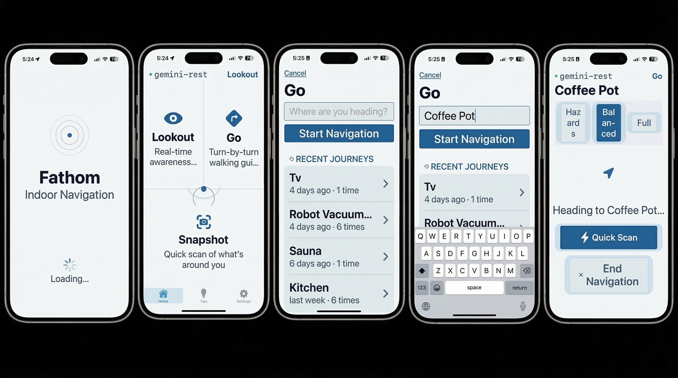
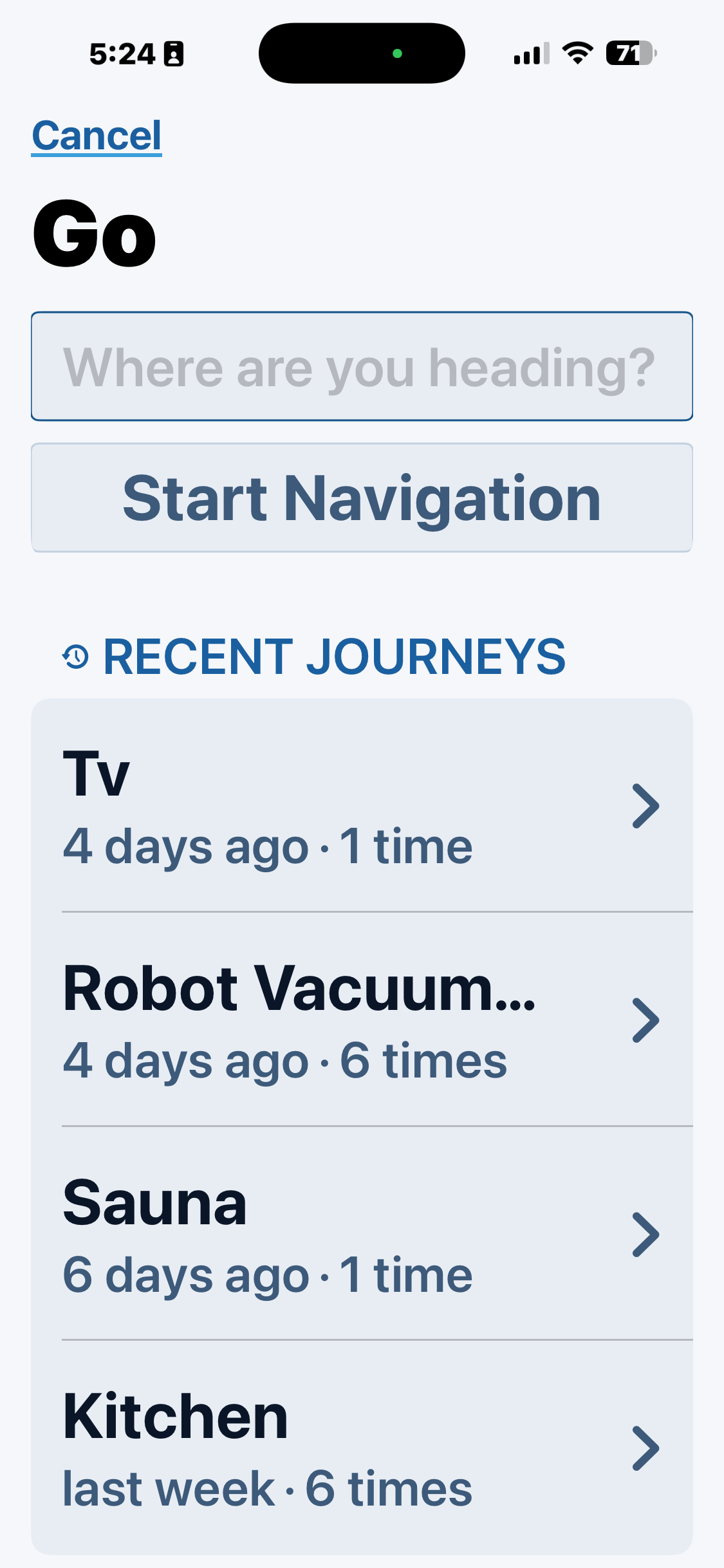
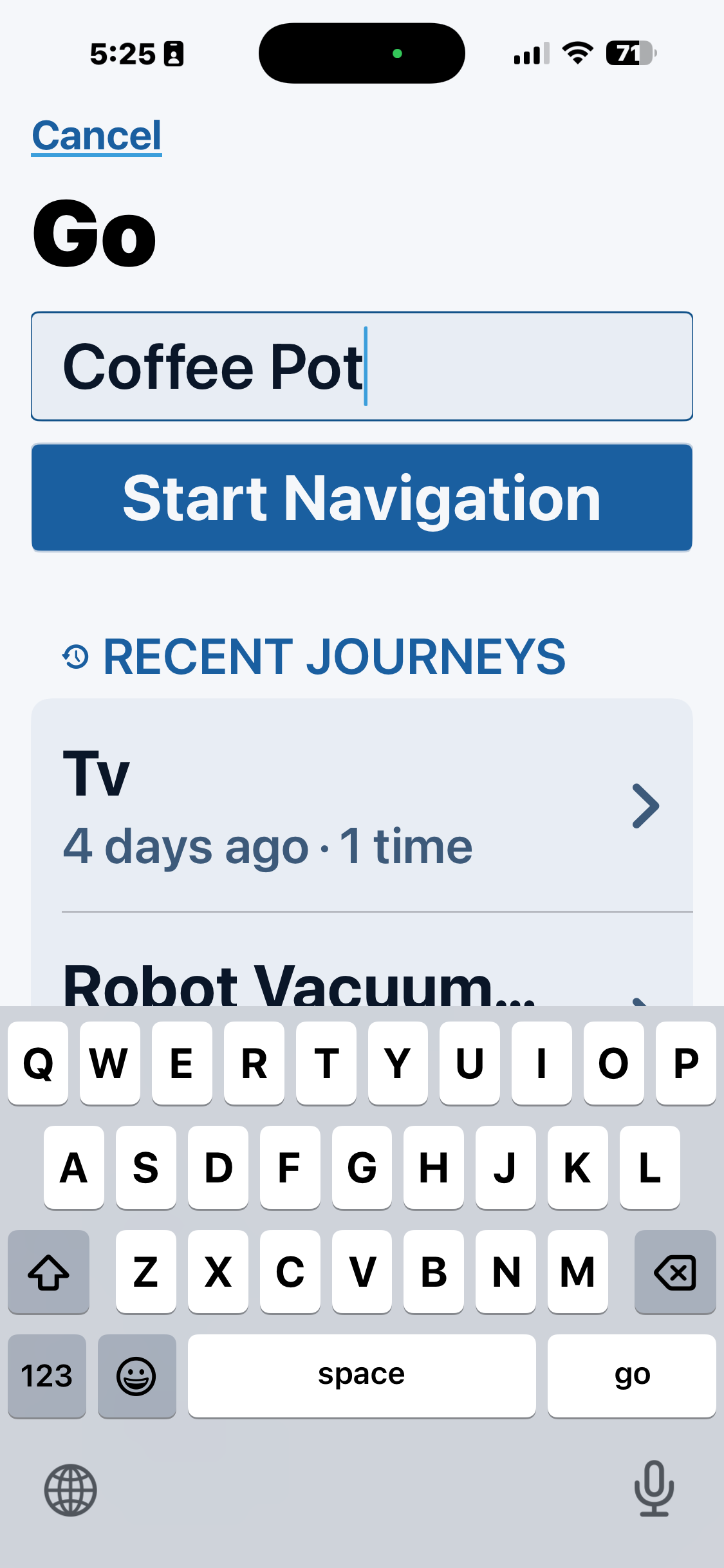
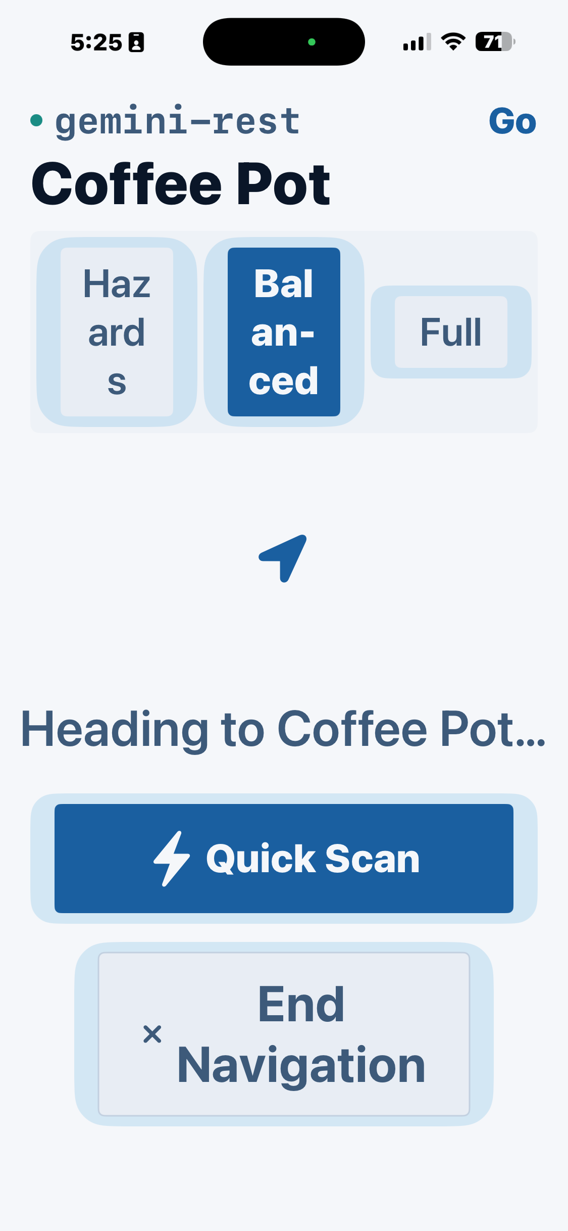
Fathom's core flow: from mode selection through destination search to active turn-by-turn navigation — designed for VoiceOver-first interaction with large touch targets and high-contrast UI.
Lookout — silence as interface
Lookout is the heart of Fathom. The AI continuously analyzes the camera feed at optimized frame rates but speaks only for hazards: steps, head-height obstacles, collision-course people, floor surface changes. Concise alerts in 3–5 words using clock-face directions. Everything else is silence. On-device LiDAR provides a second safety layer — detecting step-downs and elevation changes with depth sensing that works independently of the cloud AI model, using 6-frame temporal filtering to eliminate false positives. Users learn to trust the quiet within minutes. If the app isn't talking, the path ahead is clear.
Snapshot — on-demand spatial context
One tap from any mode triggers Snapshot. The AI captures a photo and delivers a structured spatial description: space type, what's ahead, left and right using clock positions, landmarks, signage, and people. Distances in footsteps for close objects, feet for farther ones. Snapshot includes an adaptive verbosity system — quick, standard, or detailed — with automatic tier upgrades in unfamiliar environments and diff mode for rapid re-triggers that only describes what's changed. It's accessible via the iPhone's Action Button through a custom AppIntent, so users can trigger it without navigating the UI.
Go — turn-by-turn indoor wayfinding
Speak a destination and Go guides you there. An OCR pipeline reads room numbers and signs as you pass them, turns are pre-announced 15 feet before junctions, and arrival is confirmed with door-handle position and threshold details. When Gemini is unavailable, a local fallback provides navigation cues every 8 seconds using on-device ML detections and OCR. The arrival flow requires user confirmation before declaring success — because getting arrival wrong would destroy the trust the entire product is built on.
Session bridging — invisible continuity
Gemini Live API has a 10-minute session limit. Fathom rotates sessions at the 9-minute mark, carrying accumulated context and landmark memory into the new session via structured system prompts. The user never knows it happened. Landmarks described in minute 3 are still referenced in minute 15. The modular AI abstraction layer (AIVisionProvider protocol) means the app can swap models through configuration — so as better vision models ship, Fathom improves automatically without code changes.
Results
What Changed
Fathom is in active testing on physical devices and preparing for a broader TestFlight pilot with blind and low-vision testers recruited through accessibility community organizations. Exit criteria: 80%+ task completion without assistance, crash-free rate above 95%, VoiceOver compatibility confirmed across multiple devices. The app is available at fathomvision.app.
The core thesis is confirmed: real-time AI vision through a phone camera, combined with on-device depth sensing, can provide useful hazard detection and spatial awareness for blind indoor navigation — with latency under 2 seconds from camera frame to spoken alert.
A solo product designer who came in knowing nothing about Swift, mobile hardware, or AI API integration shipped a production-quality native iOS app in 6 weeks by combining 15+ years of product design methodology with agentic development workflows. The design artifacts that drive good product outcomes — PRDs, research synthesis, information architecture, system prompts — became more valuable in this context, not less. They were the mechanism for communicating intent to an AI that could write the code.
Reflection
What I Learned
Lived experience is research, not bias
Having LHON doesn't make me the user — the spectrum of visual impairment is vast, and my experience is one data point. But it gives me a calibration that no amount of secondary research can replicate. I know the difference between an interface that looks accessible and one that actually works when you can't see it clearly. That calibration made every community conversation more productive because I could ask better questions.
Silence is the hardest thing to design
Counterintuitive: the most important feature of a product for blind users is knowing when not to speak. Every instinct says give them more information. The community taught me that confidence grows in the quiet. Getting the silence right required more iteration than any visual component I've ever designed.
System prompts are the new component library
In an AI-native product, the system prompt is the primary design surface. I iterated on Fathom's prompts the same way I'd iterate on a design system — with explicit rules, anti-patterns, and personality specifications. The Lookout prompt's "what does NOT trigger speech" section is more important than the "what does" section. Defining the negative space of AI behavior is a design skill that barely existed two years ago.
Agentic workflows amplify rigor, they don't replace it
The speed came from AI. The quality came from the same practices I'd use on any product: a thorough PRD, detailed feature specs, architectural reviews, real-device testing, community feedback loops. Claude Code let me ship faster — but the reason the product is good is because I did the design work first. The artifacts that drive good product outcomes became more valuable in an agentic workflow, not less, because they're the structured context the AI needs to produce useful output.
Design for the full spectrum, not the average
Fathom works for someone with no light perception and someone with 20/200 acuity — not by offering separate modes, but by ensuring every interaction has visual, audio, and haptic channels. The low-vision mode scales touch targets to 56pt and increases contrast, but it doesn't change the information architecture. The app is the same app for everyone. That's what accessibility-first means.
Build the thing that lets you swap the thing
The AI abstraction layer was more work upfront but it means Fathom isn't a Gemini app — it's a navigation app that happens to use Gemini today. When a better model ships next month, it's a configuration change. Products built on AI need structural independence from any single provider to survive the pace of change in this space.
Knowing enough beats knowing everything
Coming into Swift without a software engineering background felt like a liability. It wasn't. The goal wasn't to become an iOS engineer — it was to know enough to make real architectural decisions, catch bugs that looked correct, and understand why a given implementation would or wouldn't work for a blind user navigating a building at chest height with a phone. That's a different bar than mastery, and it was the right bar. The product design skills transferred in the most unexpected places: information architecture maps almost directly to service layer design, and system-level thinking about user flows translates into thinking about state management.
Performance is a UX problem
Every performance decision in Fathom is also a UX decision. Frame rate determines detection frequency. Memory management determines whether the app crashes after 20 minutes. Thermal management determines whether users can navigate a large building without the phone overheating and throttling. These feel like engineering concerns until you think about who's relying on this app and where — and then they feel exactly like the accessibility constraints they are. Performance optimization on a device people carry is not about benchmarks. It's about sustained real-world reliability, which is a design requirement.
Shipping teaches you things testing doesn't
Getting a build onto TestFlight and eventually into App Review exposed a category of problems that don't exist in development: provisioning failures, privacy manifest requirements, the gap between what the app does and how it describes itself in metadata. The App Store is not just distribution — it's a quality bar with real gatekeeping. Understanding Apple's review process from the inside changed how I think about app quality and what "done" means for a native product. Shipping to real testers on real devices is different from testing on your own phone, in ways that only become clear when you do it.